Background

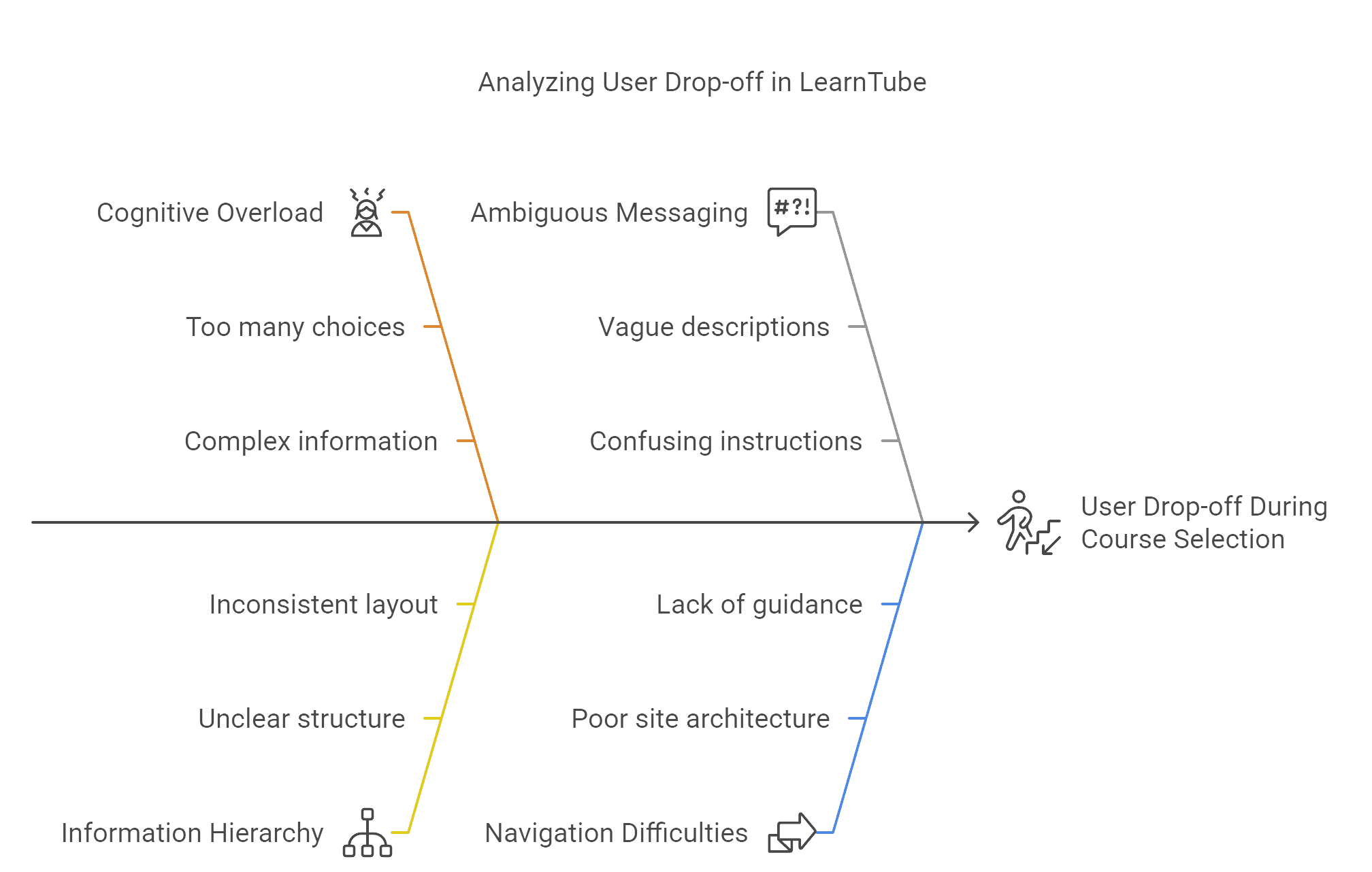
Problem: I identified significant user drop-off during LearnTube's crucial course selection phase. My analysis revealed users suffered from cognitive overload, unclear information hierarchy, ambiguous messaging, and navigation difficulties, which severely hindered conversion and retention.

My Solution (at a High Level): I proposed a strategic redesign centered on simplifying the user experience by applying cognitive psychology principles (specifically Miller's Law and Progressive Disclosure). My approach also heavily emphasized deep personalization tailored to user career ambitions and incorporated stronger trust signals.

Key Outcome & Impact (Projected Goals): My redesign strategy targets ambitious goals: achieving a 25-30% increase in course purchase conversion rates and a 15-20% increase in user retention upon successful implementation

The Challenge

Business Context: LearnTube, by CareerNinja, aims to empower learners with career-relevant skills. However, the course selection bottleneck directly threatened the platform's growth and user success by causing high drop-off rates before users even enrolled. Fixing this friction point was critical to achieving LearnTube's business objectives.  

User Pain Points (Identified through Analysis): My analysis of the existing experience pinpointed several critical user frustrations:

  • Cognitive Overload: Users were simply overwhelmed by the amount of information and choices presented simultaneously.  

  • Unclear Hierarchy & Navigation: Users struggled to understand the options and navigate the selection process effectively.  

  • Ambiguous Messaging: The value proposition and specific outcomes of courses weren't communicated clearly.  

  • Visual Inconsistencies: Lack of visual coherence added to user confusion.  

Technical Constraints (Considered in Strategy): I recognized that implementing my proposed personalization strategy would require significant technical investment in a sophisticated backend engine, robust data integration, and a reliable A/B testing framework for validation.  

Key Metrics Before (Inferred Baseline): The identified problems strongly suggested a baseline characterized by high drop-off rates within the selection funnel, low conversion rates to enrollment, and user feedback likely reflecting confusion and frustration.

The "Why" Behind My Design

Design Principles & Philosophy: I based my redesign strategy on core principles aimed at tackling the identified issues head-on:

  • Cognitive Load Reduction: Applying psychological principles like Miller's Law (chunking choices) and Progressive Disclosure (revealing info gradually) to make decisions easier.

  • Personalization for Relevance: Shifting from generic listings to tailored recommendations and learning paths directly linked to user career ambitions, making the value instantly clear.

  • Clarity & Simplicity: Focusing on straightforward navigation, clear value propositions, and unambiguous language.  

  • Trust & Credibility: Systematically building user confidence through testimonials, career outcome data, partner logos, and clear communication about certifications.  

  • Visual Hierarchy & Consistency: Employing strong visual cues and reducing clutter to guide the user's eye and create a cohesive experience.  

Key Strategic Decisions (My Rationale):

  1. Simplify Choice via Chunking (Miller's Law):

    Why? To combat initial overwhelm by limiting immediate options (like proposing 3 skill levels).

    Trade-off: Success relies heavily on the subsequent personalization being effective.


  2. Implement Progressive Disclosure:

    Why? To break down complex course information into manageable steps, revealing details as needed.

    Trade-off: Needs careful user research to ensure critical information isn't hidden too deeply.


  3. Focus Personalization on Career Outcomes:

    Why? To create a strong differentiator against competitors by making learning directly relevant to achieving specific user goals.

    Trade-off: Requires significant investment in recommendation algorithms and detailed course metadata.


  4. Emphasize Outcome-Based Trust Signals:

    Why? To build credibility based on tangible results (salary data, hiring companies) rather than relying on academic affiliations many competitors use.

    Trade-off: Effectiveness hinges on the authenticity and verifiability of these claims.  

Cross-Functional Collaboration: (Required for Implementation) Executing this strategy would demand close collaboration between myself (leading design/strategy), data science/engineering (for the personalization engine), content teams (for metadata), and marketing (for messaging and trust signals).

The Design Process

Research & Insights (Analysis Driven): My strategy stemmed directly from analyzing the existing platform's shortcomings and user friction points. The core insight was that reducing cognitive load and increasing personalization tied to tangible goals were the most critical levers for improving conversion and retention. Competitive analysis also revealed opportunities to differentiate through outcome-focused trust signals.


Ideation & Exploration: My conceptual work focused on translating these insights into tangible interface solutions:

  • Structuring initial choices using chunking principles (e.g., the 3 skill levels concept).

  • Designing interfaces applying progressive disclosure for course details.

  • Sketching visual representations of personalized learning paths linked to career goals (like the 4-week growth chart concept).  

  • Exploring layouts that prominently feature career outcome data and testimonials as trust signals.  


Prototyping & Testing (Planned Next Steps): My analysis strongly recommended user research and testing before implementation. My plan involves:  

  • Creating prototypes of the redesigned key screens.

  • Conducting usability testing to validate if the simplified choices are clear, if progressive disclosure works effectively, if personalized recommendations are perceived as relevant, and if the trust signals resonate.

  • Iterating on the designs based directly on user feedback.

Key Design Solutions

Enhancing Trust and Credibility through Prominent Social Proof: The redesign strategically incorporates prominent social proof to build user trust and credibility, addressing a key principle outlined in the case study. While the "before" screen focused solely on gathering user input (skill level), the "after" screen introduces a dedicated section showcasing logos of "trusted companies" (e.g., Netflix, Google, Microsoft). This addition serves as a powerful trust signal, implying validation or usage by reputable organizations, which can significantly alleviate user concerns about platform legitimacy and effectiveness, especially for a platform potentially lacking traditional academic affiliations. This visual reinforcement of credibility aims to increase user confidence at a crucial stage in the onboarding or course selection process.

Skill Level


Reducing Cognitive Load through Choice Chunking & Improved Hierarchy: The redesign directly tackles the identified problem of cognitive overload caused by presenting users with an overwhelming number of course options immediately. Applying the principle of Miller's Law (which suggests people can hold ~7±2 items in working memory), the solution drastically reduces the number of initially visible course/topic choices and organizes them into a structured, visually scannable grid. This contrasts sharply with the "before" state, which displayed a long, undifferentiated list of numerous options, likely exceeding cognitive capacity and contributing to decision paralysis. By chunking the choices and improving the visual hierarchy, the "after" design aims to make the initial topic selection less daunting and more manageable for the user.

Landing Page


Improved Information Architecture & Visual Hierarchy: The redesign transforms a dense, single-column layout ("before") into a well-structured page with clearly defined sections ("after"). By organizing content logically under headings like "Curriculum," "Projects," "Tools," and "Testimonials," and using whitespace effectively, the design significantly improves visual hierarchy and scannability. This directly addresses the core problems of cognitive overload and unclear information hierarchy identified in the LearnTube analysis, making complex information easier for users to process and understand.

Purchase Screen

Impact & Results

Quantifiable Success

Key Metrics Goals: The redesign strategy I formulated explicitly targets significant improvements:

  • Course Purchase Conversion Rate: Targeting a 25-30% increase.  

  • User Retention Rate: Targeting a 15-20% increase.  

Quantifiable Achievements (Expected): Upon successful implementation of my proposed design, I expect to see:

  • A measurable reduction in drop-off rates within the course selection funnel.

  • Increased user engagement with personalized recommendations.

  • Higher enrollment rates stemming from increased clarity and trust.

Business Value (Anticipated): My proposed redesign aims to directly drive business growth through increased conversions and improved customer lifetime value via better retention. It should also strengthen LearnTube's market position by offering a more effective, personalized user experience.

Qualitative Feedback (Anticipated): I expect post-launch user feedback to reflect reduced confusion, increased confidence in course choices, and appreciation for the career-focused guidance, validating my strategic approach. (Actual feedback requires implementation and testing).

Demonstrating Growth and Strategic Thinking

Key Takeaways (from My Analysis & Strategy Formulation):

  • Cognitive Load is a Major Barrier: My analysis confirmed that overwhelming users with choices is a key reason for drop-off in e-learning selection funnels. Applying cognitive principles is essential.  

  • Generic Personalization Isn't Enough: Tying recommendations directly to explicit, meaningful user goals (like career ambitions) offers a far stronger value proposition.  

  • Trust is Paramount: Especially in a crowded market, proactively building credibility through verifiable outcomes and social proof is critical.  

  • Execution Requires Rigor: The success of these strategies depends entirely on careful implementation, deep user research for validation, and robust technical infrastructure,

Future Implications: My work on this strategy highlights the importance of a deeply user-centered and psychologically informed approach to designing complex selection processes. Future iterations should continue to leverage user data and A/B testing to refine personalization algorithms and further optimize the user journey based on the principles I established.

Areas for Future Exploration (My Recommendations Based on Analysis): I recommend exploring enhancements like community/social learning features to boost retention, gamification linked to career progress, more advanced AI-driven adaptive learning paths, and potentially verifiable micro-credentials to further strengthen the career outcome focus.

Visuals from Figma

Visuals from Figma